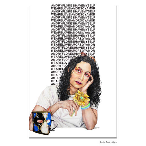
At the Table | The Architecture of Control
At the Table: The Architecture of Control is a research-based installation and portrait project examining the structural processes through which 2SLGBTQ+ people have been excluded from the institutional rooms where decisions about their lives were made. The work is not about the consequences of that exclusion. It is about the mechanism.
At the centre of the work is a series of large-scale portraits. Each sitter faces the viewer from a white table surface. Behind them, text authored by the subjects moves across the picture plane in a dense, unpunctuated, all-caps block, the visual language of institutional documents. The friction between that language and the bodies it surrounds is the argument the portraits make.
Centered in the gallery is a single institutional table, chair bolted and locked. Around it, twelve portraits. The exclusion is not historical. It is structural. It is still here.
Conceptual Framework for At the Table
1. Administrative Authority and the Seated Figure
The seated posture is drawn from historical portrait conventions in which the person with “the seat” held authority. At the Table repositions this structure. The sitter occupies a place typically tied to evaluation or judgment, but here they hold the position of witness, interrupting the visual hierarchy that once defined who was entitled to appear with authority.
2. Institutional Typography
The typographic system mirrors the fonts used in legal, medical, and bureaucratic documents. These styles signal regulation and standardization. Their presence on the portrait surface highlights how administrative systems have documented, classified, or restricted queer and trans people. The fonts act as institutional residue rather than decorative design.
3. White Clothing as Institutional Neutrality
White clothing removes cultural and economic markers, echoing the “neutral” or unmarked body in administrative imaging. In this context, white refers to the flattening effects of institutional processes, where individuality is stripped in favour of standardization. It signals structural erasure rather than purity or aesthetic minimalism.
4. Objects as Personal Evidence
The objects placed on the table serve as forms of personal evidence that fall outside institutional categories. Unlike historical portrait props used to communicate status, these items reflect memory, grounding, and lived experience. They function as components of testimony, countering the limited fields of information captured in formal records.
5. Hyperrealism as Counter-Documentation
Hyperrealism has historically been tied to authority—state portraiture, forensic illustration, and scientific observation. In this series, high-resolution drawing becomes a method of counter-documentation. It applies the visual precision of official imaging to individuals often misrepresented or excluded by those systems, creating records that operate outside institutional control.


